Design and Use Policy for Clearview Alphabet
Frequently Asked Questions — Design Criteria for the Use of Alternative Alphabets Subject to Interim Approval
Introduction
A number of questions have been asked with regard to the Interim Approval dated September 2, 2004 for the alternative highway sign letter style, ClearviewTM. The use of this alternative lettering style is completely optional and is neither required nor recommended. The FHWA has prepared the following information to assist agencies, sign designers, and sign fabricators in understanding the application and design parameters to be consistent with the Interim Approval if an agency has chosen, and received FHWA approval, to use the alternative alphabets. Additional information regarding the use of traffic control devices under an Interim Approval can be found in Section 1B.07 of the MUTCD.
Frequently Asked Questions
- Does FHWA now require Clearview in place of the Standard Alphabets?
- I read in a newspaper article that Clearview lettering is significantly better than the old highway lettering we use on our signs. Should we use Clearview alphabets on all our signs?
- If my agency has adopted Clearview, should I revise all the standard positive-contrast signs to use Clearview as well?
- Under what conditions can I expect to see a benefit from using Clearview?
- How was the legibility improvement achieved?
- Does this mean I should no longer use Series E-modified on signs?
- When designing signs with Clearview, do I use the letter height criteria from the MUTCD in the same way as the Standard Alphabets?
- If I reduce the letter height, can I still use Clearview as long as it provides the same legibility as the Standard Alphabets?
- Does this mean I can still get better legibility by using Clearview even with a letter height smaller than the Standard Alphabets?
- Since Clearview is so much more legible than the old highway lettering, and it was based on using upper- and lower-case letters, should I now display all lettering on signs using upper– and lower-case letters as I've seen illustrated in some documents?
- Does this mean all letters, numerals, and characters of Clearview are significantly more legible?
- I've seen fractions displayed in many different ways and my software does not allow me to display fractions as described in the MUTCD. Should I just use what the software produces?
- Should I use the same interline spacing that I used with the Standard Alphabets?
- Can I replace my existing signs that use E-modified with any type of the Clearview lettering?
- My agency has adopted Clearview for all its destination legends on signs and we plan to specify 5-W-R instead of 5-W for all signs. Is this acceptable?
- We've replaced some of our very old guide signs with new ones using Clearview and have received positive feedback that the new signs look better. How else should I monitor the effectiveness of the new signs?
- Does FHWA plan to discard the Standard Alphabets and replace them with the alternative alphabets?
- I heard on my morning news program that I have to change my Street Name signs to use upper– and lower-case letters (instead of all upper-case) and that this was called Clearview. Is this statement accurate?
- Should I also be considering Clearview for non-freeway guide signs, such as Street Name signs and Destination signs on conventional roads?
- I recently read in a nationally endorsed compendium of treatments for non-motorized vehicles that Clearview should be used on guide signs for bicycle facilities because "it is commonly used for guide signs in the United States." Is this recommendation accurate?
Questions and Answers
- Q: Does FHWA now require Clearview in place of the Standard Alphabets?
A: There is neither a requirement nor recommendation for any agency to use an alternative letter style. The use of this alternative letter style is subject to Interim Approval and an agency must first request and be granted permission by FHWA to use it.
Return to Top
- Q: I read in a newspaper article that Clearview lettering is significantly better than the old highway lettering we use on our signs. Should we use Clearview alphabets on all our signs?
A: The use of Clearview as an alternative to the Standard Alphabets is allowed only on positive-contrast (white legend on a green, blue, or brown background) guide signs, as this contrast orientation is the only one that has demonstrated an improvement in legibility distance to date for those legends composed of upper- and lower-case letters when using specific series of Clearview lettering. The use of Clearview in negative-contrast color orientations, such as on regulatory and warning signs, has been shown to decrease legibility distance when compared with the FHWA Standard Alphabet series.
Figure 1a. NOT ACCEPTABLE: Improper uses of Clearview in negative-contrast orientation, improper uses of upper- and lower-case lettering.
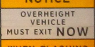
Figure 1b. NOT ACCEPTABLE: Improper uses of Clearview in negative-contrast orientation.
Return to Top
- Q: If my agency has adopted Clearview, should I revise all the standard positive-contrast signs to use Clearview as well?
A: No. Standard signs (except those with variable destination legends displayed in upper- and lower-case letters) shall retain their distinct designs using the FHWA Standard Alphabets and shall not be redesigned to employ an alternative alphabet, regardless of contrast orientation. The narrower series of Clearview that would typically be used for standard sign legends did not provide for longer legibility distances. For example, 3-W was found to be less legible than the comparable Series D of the Standard Alphabets. Route signs shall continue to use the FHWA Standard Alphabets for numerals and letters.
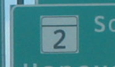
Figure 2. NOT ACCEPTABLE: Examples of improper use of Clearview numerals in route signs.
Return to Top
- Q: Under what conditions can I expect to see a benefit from using Clearview?
A: The greatest improvement in legibility distance afforded by Clearview was realized by older drivers with poor vision (worse than 20/40 visual acuity) when mixed-case legends (those composed of an initial upper-case letter followed by lower-case letters) were viewed under vehicle headlamp illumination during nighttime conditions (an increase in legibility distance of approximately 5 percent for signs that are not otherwise illuminated). A like improvement was not demonstrated for other types of legends that use all upper-case lettering, such as action or distance messages or those found on standard signs.
Return to Top
- Q: How was the legibility improvement achieved?
A: The percentage improvement in legibility distance indicated by the studies referenced in the Interim Approval is based on the cumulative effect of a change in two variables: (1) the mixed-case alphabet (Clearview 5-W in place of Series E-modified) and (2) the retroreflective sheeting (Microprismatic in place of Encapsulated Lens). The aggregate improvement is the result of the combination of the two changes.
Return to Top
- Q: Does this mean I should no longer use Series E-modified on signs?
A: The use of Standard Alphabet Series E-modified with Microprismatic retroreflective sheeting also produced an improvement in legibility over use of the same with Encapsulated Lens sheeting. A 6.3-percent increase in legibility can be achieved simply by changing from encapsulated lens sheeting to microprismatic retroreflective sheeting.
Return to Top
- Q: When designing signs with Clearview, do I use the letter height criteria from the MUTCD in the same way as the Standard Alphabets?
A: No. It is important to understand that the way in which the legibility of the alternative letter style is enhanced is by increasing the letter height—specifically, the height of the lower-case letters. Letter heights for Clearview shall be determined by the specified upper-case letter height according to the MUTCD as usual. However, the lower-case loop height shall be 84% of the corresponding upper-case letter height (instead of 75% as specified for the Standard Alphabets; see MUTCD Section 2A.08 for definition of loop height). For example, a specified upper-case letter height of 16 inches would have a corresponding lower-case loop height of 13.44 inches for the alternative letter style. (By contrast, the Standard Alphabet lower-case loop height would be 12 inches for a 16-inch initial upper-case letter.)
The convention specified for the Standard Alphabets shall not be applied to the alternative alphabet for the determination of the lower-case loop height. The evaluations that demonstrated the above-stated legibility enhancement were predicated on an enlargement of the lower-case loop height. Using a proportion less than 84%, therefore, cannot justify a deviation from the FHWA Standard Alphabets.
Return to Top
- Q: If I reduce the letter height, can I still use Clearview as long as it provides the same legibility as the Standard Alphabets?
A: No. The intent of an Interim Approval is to provide for an improvement over the current provisions of the MUTCD until such time that it is found appropriate to amend the MUTCD. An Interim Approval is not intended to provide an equivalent alternative for provisions that already exist in the MUTCD. Changes to the MUTCD are made to improve traffic control devices, not to offer equivalent alternatives.
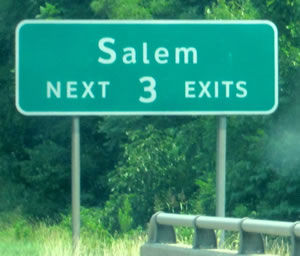
Figure 3. NOT ACCEPTABLE: Incorrect proportion of lower-case loop height (undersized) to initial upper-case letter height.
Return to Top
- Q: Does this mean I can still get better legibility by using Clearview even with a letter height smaller than the Standard Alphabets?
A: The incremental legibility gain from Clearview was achieved only by making the letters larger than a comparable Standard Alphabet series, specifically by enlarging them by 12 percent.
Return to Top
- Q: Since Clearview is so much more legible than the old highway lettering, and it was based on using upper– and lower-case letters, should I now display all lettering on signs using upper- and lower-case letters as I've seen illustrated in some documents?
A: Mixed-case legends are restricted to place names and destinations; all other messages such as action and distance messages, cardinal directions, and auxiliary designations shall remain composed of all upper-case letters employing the the MUTCD criteria. Legends composed of all upper-case letters did not demonstrate a like improvement over the Standard Alphabets when displayed using Clearview. Accordingly, words composed of all upper-case letters continue to use the Standard Alphabets.
Return to Top
- Q: Does this mean all letters, numerals, and characters of Clearview are significantly more legible?
A: Numerals and special characters have not been tested for legibility and concerns have been reported thereon in field applications. Therefore, numerals continue to be displayed on highway signs using the Standard Alphabets.
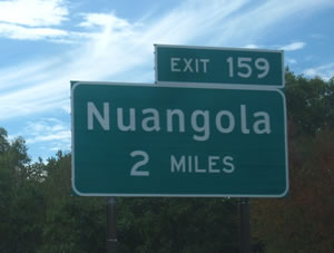
Figure 4. ACCEPTABLE: Example of appropriate use of Clearview for destination legend (mixed-case) and FHWA Standard Alphabets for other legends (all upper-case and numerals).
A guide sign is shown with the legend "Nuangola 2 MILES." The destination of Nuangola is displayed in upper- and lower-case letters of the alternative alphabet. The distance legend of 2 MILES is shown in all upper-case letters of the Standard Alphabets.
Return to Top
- Q: I've seen fractions displayed in many different ways and my software does not allow me to display fractions as described in the MUTCD. Should I just use what the software produces?
A: Fractional distances shall use the standard display format of one-and-one-half times the height of the numerals within the fraction. The height of the numerals within the fraction shall be the same as the height of the letters in the distance units (e.g., MILE, FEET). The numerator and denominator of the fraction shall be diagonally arranged about the solidus. If the sign design or fabrication software does not produce a layout that conforms to the provisions of the MUTCD, then that function might need to be manually overridden to achieve a correct arrangement of the legend elements.
Figure 5a. NOT ACCEPTABLE: Incorrect alignment of fraction numerals and inadequate interline and edge spacing.
Figure 5b. ACCEPTABLE: Correct alignment of fraction numerals.
Return to Top
- Q: Should I use the same interline spacing that I used with the Standard Alphabets?
A: Interline spacing is determined by the letter height within the lines of legend. For the Standard Alphabets, the MUTCD recommends 75% of the upper-case letter height, which corresponds to 100% of the lower-case loop height. The ascending strokes of the Standard Alphabet lower-case letters extend to the same height as the initial upper-case letter. However, the same is not true for the alternative alphabet. Because the lower-case loop height is a larger proportion of the upper-case letter height, so, too, are the heights of the ascending strokes of the lower-case letters. Therefore, for the alternative alphabets, the recommended space between lines of legend is equivalent to the lower-case loop height, or 84% of the initial upper-case letter height, to avoid a crowded appearance that can inhibit legibility and orderly processing of a sign legend by the observer.
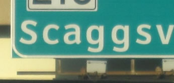
Figure 6. NOT ACCEPTABLE: Examples of inadequate interline and edge spacing.
Return to Top
- Q: Can I replace my existing signs that use E-modified with any type of the Clearview lettering?
A: When instituting a system of freeway and expressway guide signs using Clearview, the standard character spacing (5-W) is used for the majority of the signs along the system. Clearview 5-W-R provides for reduced letter spacing only in those limited situations where an existing sign support structure does not have the design capacity to accommodate the increase in sign area necessitated by the use of Clearview 5-W with its standard letter spacing.
Return to Top
- Q: My agency has adopted Clearview for all its destination legends on signs and we plan to specify 5-W-R instead of 5-W for all signs. Is this acceptable?
A: No. The legibility of Clearview 5-W-R was found to be comparable to that of Series E-modified and, therefore, does not support the basis for the Interim Approval or an agency standard because it is not an improvement over the current standard. Clearview 5-W-R is restricted only to those situations where a new sign is installed on an existing sign support structure that does not have additional design capacity to accommodate a larger sign.
Return to Top
- Q: We've replaced some of our very old guide signs with new ones using Clearview and have received positive feedback that the new signs look better. How else should I monitor the effectiveness of the new signs?
A: To evaluate the effectiveness of signs that employ Clearview, it is recommended that a control corridor be established to evaluate whether any perceived improvement is the result of a change in the letter style, retroreflective sheeting, or a combination thereof.
Return to Top
- Q: Does FHWA plan to discard the Standard Alphabets and replace them with the alternative alphabets?
A: FHWA has no plans at this time to discontinue specifying the Standard Alphabets. The use of Clearview, therefore, is still subject to Interim Approval.
Return to Top
- Q: I heard on my morning news program that I have to change my Street Name signs to use upper– and lower-case letters (instead of all upper-case) and that this was called Clearview. Is this statement accurate?
A: No. The requirement for the use of mixed-case legends in the 2009 MUTCD does not necessitate the use of another letter style in place of the FHWA Standard Alphabets, which have lower-case alphabets for all letter series.
Further, there has never been a requirement to change an existing sign for the sole purpose of displaying its legend using upper– and lower-case letters instead of all upper-case. Instead, the requirement to display destinations and roadway names in upper– and lower-case letters is met when existing signs are replaced for other reasons, such as serviceability.
Return to Top
- Q: Should I also be considering Clearview for non-freeway guide signs, such as Street Name signs and Destination signs on conventional roads?
A: The narrower series of Clearview that would typically be used on conventional road signs—those other than 5-W and 5-W-R—have generally not been evaluated for legibility. Therefore, the Standard Alphabets continue to be used on these signs. (Clearview 3-W has been evaluated and has been found to be less legible than the comparable Standard Alphabet Series D).
Return to Top
- Q: I recently read in a nationally endorsed compendium of treatments for non-motorized vehicles that Clearview should be used on guide signs for bicycle facilities because "it is commonly used for guide signs in the United States." Is this recommendation accurate?
A: The statement is not accurate and the recommendation is unfounded. The greatest benefit attained from the use of Clearview was for older drivers when signs were viewed under motorized vehicle headlamp illumination using the 5-W alphabet. By contrast, Clearview did not produce longer legibility distances than the Standard Alphabets under daytime viewing conditions. Because bicycle headlamps do not emit a level of irradiance or intensity that is similar to that of motorized vehicles, their incidence on sign retroreflectivity does not result in nighttime viewing effects comparable to those of highway-speed environments. Accordingly, the Standard Alphabets are used on all signs for bicyclists.
Return to Top