| FHWA Policy Memorandums |
 |
Traffic sign lettering is optimized for rapid viewing and recognition at a range of traffic speeds and standardized so that signs can be designed to perform based on the short available viewing time by drivers. This is because the reading process for traffic signs differs greatly from the task of reading another media which is typically done from a stationary position at a relatively close distance. By contrast, for drivers to operate their vehicles in a relatively safe manner, they must view traffic signs at highway speeds only through short glances, which requires them to take their eyes and concentration away from the road and traffic around them. Therefore, the lettering on traffic signs is designed for quick recognition, as are all design aspects of signs—these factors include the amount of information; the size of lettering and any symbols; contrast between the colors of the legend and background; and spacing between words, lines of copy, and sign edges.
The design of traffic sign lettering itself comprises several factors. These include the shape of the letter, i.e., the letter form, and the space between letter pairs within a word. The collection of the letter forms (the shapes of each individual character) is commonly referred to as a "typeface." The specific spaces between combinations of letters within the typeface is a component of what is commonly referred to as a "font." In engineering terms, the "font" (the letter form and letter-pair spacing) is referred to as an "alphabet." Hence, the sets of standard lettering for traffic signing are referred to as the Standard Alphabets. Terminology is summarized in Table 2.1.
Within the Standard Alphabets are six variations of letter typeface or styles, called "Letter Series." The letter forms of each letter series become progressively wider for a given letter height. In addition, the width of the letter stroke, i.e., thickness, also increases with each series. The Standard Alphabet letter series range from Series B, a narrow stroked and condensed letter form, to Series F, a broad letter form with wide stroke (see Figure 2.1). Series A was previously discontinued because it was unworkable in manual fabrication applications. Series E(modified) uses the same letter forms and spacing as Series E, but has a wider stroke. Each of the Standard Alphabet letter series contains a full set of numerals and limited set of special characters including punctuation that correspond to the letter forms and stroke widths of that series. The FHWA Standard Alphabet series letter forms are illustrated in Figure 2.1.
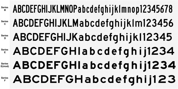
Figure 2.1. Illustration of Standard Alphabet Letter Series.
In addition to use on traffic signs, the Standard Alphabets are the official lettering specified by the Federal Aviation Administration for airside signing and markings on runways and taxiways, and are specified in Federal Motor Vehicle Safety Standards for lettering only, such as school buses. The Standard Alphabets are also the basis for roadway and airside pavement word markings, though in an elongated form for proper viewing on a horizontal surface from the position of a vehicle operator.
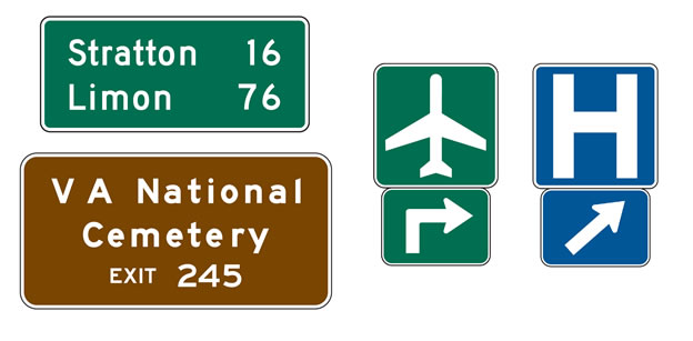
The National MUTCD is incorporated by reference in 23 Code of Federal Regulations (CFR), Part 655, Subpart F and is recognized as the national standard for all traffic control devices installed on any street, highway, or bicycle trail open to public travel in accordance with 23 U.S.C. §§ 109(d) and 402(a). Part 2 of the MUTCD deals specifically with signs, including regulatory, warning, and guide signs used on conventional roads and streets, freeways and expressways, and toll roads. Part 2 also includes signs providing general information and services, tourist-oriented destinations, recreational and cultural interest areas, changeable message signs, and emergency management signing.
This report addresses the fonts used on freeway and expressway guide signs, which is the predominant and appropriate application of Clearview in the Interim Approval. Section 2E.14 of the MUTCD describes the provisions for the size and style of letters and signs for freeway and expressway guide signs. Paragraph 4 of that Section states, "…letters and numerals used shall be Series E(M) [E(modified)] of the 'Standard Highway Signs and Markings'; (SHSM) book." Based on early research on alternative fonts indicating that other fonts might have increased legibility over the Standard Alphabets, the FHWA issued Interim Approval No. 5 for the Use of Clearview Font for Positive Contrast Legends on Guide Signs (IA‑5) on September 2, 2004. Due to concerns over uniformity and subsequent research that suggested there was no practical improvement, the FHWA officially terminated the Interim Approval on January 25, 2016, thus discontinuing the provisional use of an alternative letter style in traffic control device applications and, thereby, again requiring that the FHWA Standard Alphabets be used in traffic control devices, except as provided otherwise in the MUTCD.
Research into developing an alternative font began in the 1990s, resulting in the final design of Clearview font letters in 2003. The goal of the Clearview font, as stated by its developer, was to increase legibility and reduce irradiation or "halation" of highway sign legends (the blurring of light around the edges of the sign legend when viewed at night under vehicle headlamp illumination creating a fog or "halo" effect) in comparison to that of the Standard Alphabets. Clearview font letters were developed specifically in an attempt to improve upon four legibility components that the developer believed to be of concern with the Standard Alphabets:
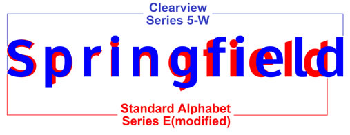
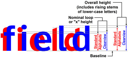
While there were no demonstrated deficiencies with the Standard Alphabets, the developers worked to advance a new letter style with improved legibility. The stated goal was to rely exclusively on modifications to the new letter forms (shapes) and stroke width. However, when this process failed to compete with the legibility and recognition of the Standard Alphabets, the developer then turned to a different characteristic of legibility: the size and height of the letters themselves. Ultimately, the developers could not achieve comparable legibility to the Standard Alphabets until the size of the letters was increased 12 percent larger than the corresponding Standard Alphabet letters. Thus, for a typical freeway guide sign destination name, the standard 12-inch lower‑case letter became 13.44 inches and the standard 16-inch upper-case letter became 17.92 inches. Further testing was then performed on Clearview to reduce the initial upper-case letter to 16 inches while retaining the lower-case height at 13.44 inches. Since letter sizes are specified by the height of the initial upper-case letter (from which the lower-case height is derived by proportion or ratio), this modification gave the perception that there was no increase in the size of the letters. In actuality, the lower-case letters with rising stems, such as "b" and "d," still extended to the full height of 17.92 inches. The comparison of letter forms and letter heights between the Standard Alphabets and Clearview is illustrated in Figure 2.2. Examples of signs with Standard Alphabet and Clearview lettering are shown in Figure 2.3.
Companion testing was never performed to determine whether the same modifications to the Standard Alphabets would have resulted in a similar improvement. Rather, the Standard Alphabets, unaltered, were simply held as the baseline while the Clearview letters were worked and reworked until some improvement was eventually realized. This process did not result in a necessarily better set of letter styles for highway signing, but rather a different set of letter styles with increased letter height and different letter spacing that was not comparable to the Standard Alphabets. The Standard Alphabet letter series and intended corresponding Clearview letter series and contrast orientations are shown in Table 2.2. The "W" and "B" designations of the Clearview series were assigned by the developer and represent "white" and "black," respectively, to distinguish between the letter colors that would most often be used in positive- and negative-contrast color orientations.
Notes:
Interim Approvals issued by the FHWA grant authority to State and local highway agencies to use on an interim basis new traffic control devices or applications that are not specifically provided for in the MUTCD, but have been demonstrated to be effective through testing and evaluation. Such approvals are based on the results of successful experimentation, studies, or research, and an intention to place the new or revised device into a future notice of proposed amendments to the MUTCD. This process allows the traveling public and/or operating agencies to more quickly realize the safety and operational benefits associated with such devices or applications.
In 2002, the Pennsylvania Department of Transportation (DOT) requested that the FHWA grant Interim Approval for the use of Clearview on highway signs based on the early research finding that suggested improvement in sign legibility. Because the research findings were only narrowly applicable to certain applications, the FHWA issued Interim Approval with several expectations, including: (1) that research would continue so that the remaining gaps in the research could be answered and (2) the nature of the Interim Approval was provisional and would not constitute or guarantee adoption in the MUTCD. Thus, a provisional concept could continue to be evaluated and monitored in limited deployment so that a fully informed decision could be made when considering whether to adopt the provisional concept in the MUTCD. The FHWA issued Interim Approval for the Use of Clearview Font for Positive Contrast Legends on Guide Signs (IA–5) on September 2, 2004.4 Since that date, the FHWA granted 26 State DOTs interim approval to use the Clearview font.5
Approval for Clearview was one of the earliest that FHWA had issued, within the first year that the provisions for Interim Approvals had been adopted into the MUTCD. In an effort to move new experimental technology into practice quickly using this new tool, the level of research scrutiny used to justify an interim approval was not as thorough or as rigorous as it could have been. In addition, FHWA had little experience with how Interim Approvals would be implemented by approved agencies. In the time since then, another 14 Interim Approvals allowing provisional uses of new traffic control devices or applications have been issued using the experience gained from these early approvals. As a result of the Clearview Interim Approval, the FHWA has taken a more deliberative approach to Interim Approvals that includes consideration of the long-term implications.
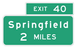
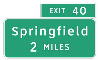
Although items for which an interim approval is granted are typically included in the next edition of the MUTCD, the Clearview font was not included in the 2009 Edition of the MUTCD. In response to the FHWA's Notice of Proposed Amendments (NPA) to the MUTCD, issued January 2, 2008 (73 FR 268),6 ATSSA, a State DOT, a research institute, and a traffic engineering consultant suggested that the FHWA add the positive-contrast Clearview font into the Standard Highway Signs publication and MUTCD based on the research done under the experimental use of the font that demonstrated significant legibility enhancements for older drivers. However, FHWA did not propose such an addition in the NPA. In the Federal Register notice of Final Rule for the 2009 Edition of the MUTCD, FHWA indicated that some research to date had shown that negative-contrast mixed-case Clearview legends are not as legible as the Standard Alphabets. As a result, the practicality of maintaining two separate alphabet systems, one for positive-contrast legends only (i.e., Clearview) and one for both positive- and negative-contrast legends (i.e., the Standard Alphabets), was taken into consideration (see Figures 2.4 and 2.5 for examples of signs in positive- and negative-contrast color orientations). In addition, the Clearview alternative alphabet did not undergo any testing on numerals and special characters, which had been reported to be problematic from a legibility standpoint, later confirmed through legibility testing, nor had any testing been performed on a narrower series that would typically be used on signs on conventional roads, such as Street Name signs. Accordingly, FHWA indicated it would be premature to categorically adopt the alternative alphabet for a marginal theoretical improvement in legibility where no supporting evidence of a demonstrable or practical improvement had been reported by those agencies that have erected signing using the alternate alphabets. The FHWA did indicate that highway agencies could continue to use the Clearview font for positive-contrast legends on guide signs under the provisions of the FHWA's Interim Approval IA-5.
In 2008, the FHWA began to include a summary of the research within its approval letters so that agencies could understand the intended use of Clearview and its limitations. When this failed to stem noncompliant practices and misuse, the FHWA issued more detailed design and use guidance in 2011 that included illustrations of acceptable and unacceptable uses and applications. This information was distributed to the States through the FHWA Division offices and posted on the MUTCD Web site for use by anyone. This, too, failed to stem what appeared to be even more widespread misapplication of Clearview. The FHWA also continued to receive technical inquiries in which it became apparent that there was a basic lack of understanding of the limitations on the use of Clearview, particularly at the local level where many municipalities and counties were under the impression that Clearview was now required and was superior to the Standard Alphabets in any and all uses. In addition, a number of unapproved Clearview series were commercially available from the developer and distributor that would, in effect, induce agencies to misapply the Clearview lettering in unapproved applications and in applications that FHWA had since recommended it not be used.
In April 2014, FHWA stopped issuing new approvals for the use of Clearview while it reconsidered whether Clearview would continue to be allowed. This fact was available to the public and was even publicized in news media.7 In October 2014, the FHWA's Office of Operations held a teleconference at the request of the Pennsylvania DOT's Bureau of Maintenance and Operations. In this teleconference, the State Traffic Engineer urged FHWA to consider all available research before making a decision about the future of Clearview. Pennsylvania DOT had since revised its specification so that only place names were displayed in Clearview. All other legends, such as exit numbers, distance messages (e.g., EXIT 1 MILE), and cardinal directions (e.g., NORTH) reverted to the Standard Alphabets. Thus, a complex design system was implemented in which a sign would be designed with two different letter styles with differing criteria. In July 2015, the American Traffic Safety Services Association (ATSSA) submitted a letter to the FHWA Administrator expressing concerns over confusion in the marketplace and amongst its membership by the presence of two standards. In this letter, ATSSA urged FHWA to make a prompt decision about the status of Clearview to minimize further confusion. In September 2015, FHWA responded to ATSSA's letter stating that it expected to announce action related to the status of Clearview "in the coming weeks." Finally, in January 2016, the Interim Approval was terminated. A timeline of actions related to the Interim Approval is provided in Table 2.3. Correspondence related to the status of Clearview is provided in Appendix A. News media stating an intent to rescind Clearview is provided in Appendix B.
Many of the States implementing Clearview were receiving positive feedback on their new signs stating that they were easier to read. News articles also reported on this topic, often including interviews with the font developer and researchers, who further promoted the letter style. However, the fact that the new signs were most often replacing decades-old signs that were in poor condition was not reported. By contrast, the new signs were clean, used much brighter retroreflective materials integrating new sheeting technologies for improved nighttime viewing, and, in many cases, used larger lettering—thus resulting in much larger signs—than their predecessors. Anecdotally, the perceived improvement was attributed entirely to the font. This information unquestionably contributed to the confusion amongst State and local departments of transportation and other agencies. Many believed that Clearview was mandated as a replacement for the entire Standard Alphabets. Some believed that they could reduce letter sizes while attaining better legibility over the Standard Alphabets, essentially getting "credit" for using Clearview, as one inquiry to FHWA was phrased.
On January 25, 2016, FHWA published a notice in the Federal Register (81 FR 4083) officially terminating, 30 days thereafter, the Interim Approval for Use of Clearview Font for Positive Contrast Legends on Guide Signs (IA-5). The termination discontinued the provisional use of the Clearview font in traffic control device applications. The result of this termination rescinded the allowance of the use of letter styles other than FHWA Standard Alphabets on traffic control devices, except as provided otherwise in the MUTCD. The termination allowed existing signs with Clearview font and that comply with IA-5 to remain in place as long as they are in serviceable condition (i.e., until they require replacement due to wear or damage). The termination did not create a mandate for the removal or installation of any sign. States using Clearview at the time of the termination are summarized in Table 2.4.
* State did not request or receive Interim Approval from FHWA as required by MUTCD § 1A.10.
** At the time of preparation of this Report, State has indicated intent to submit a request for approval.
Immediately following the publication of the termination in the Federal Register and prior to its effective date, FHWA distributed to the States a Technical Memorandum8 and a Technical Brief9 and posted these items on the MUTCD Web site for the general public. The Technical Memorandum provided guidance to the Federal-aid Highway division offices on implementation of the termination. The FHWA developed the Technical Brief for transportation agency use. It provided conclusions about the national experience with an alternative letter style and a discussion of the technical considerations that led to the termination of the Interim Approval. Key conclusions in the Technical Brief included:
After the publication of the termination, FHWA received comments from stakeholders suggesting that FHWA should have solicited public comment prior to the termination. Other comments suggested that FHWA did not consider all relevant research that was available in making its decision. As a result, FHWA published a Request for Information (81 FR 89888) to gather any information or research that FHWA may not have been aware of when the termination was prepared. Chapter 3.0 summarizes research conducted to date on the Clearview font. Chapter 4.0 summarizes the comments to the Request for Information.
You may need the Adobe® Reader® to view the PDFs on this page.
4 Interim Approval for the Use of Clearview Font for Positive Contrast Legends on Guide Signs (IA-5) can be accessed at the following Web address: https://mutcd.fhwa.dot.gov/res-ia_clearview_font.htm. [Return to Note 4]
5 Although 26 States received approval, only 13 of those approved were using Clearview in some form at the time that IA-5 was rescinded. [Return to Note 5]
6 Federal Register notice can be accessed at the following Web address: https://www.gpo.gov/fdsys/pkg/FR-2009-12-16/pdf/E9-28322.pdf. [Return to Note 6]
7 "Clearview highway font not clear enough for Grays Harbor," KXRO Newsradio, April 23, 2014, can be accessed at the following Web address: https://kxro.wordpress.com/2014/04/30/clearview-highway-font-not-clear-enough-for-grays-harbor/. [Return to Note 7]
8 Technical Memorandum can be accessed at the following Web address: https://mutcd.fhwa.dot.gov/resources/interim_approval/ia5/ia5_termination.pdf. [Return to Note 8]
9 Technical Brief, "Manual on Uniform Traffic Control Devices for Streets and Highways: Termination of Interim Approval No. 5, Clearview Font for Positive Contrast Legends on Guide Signs," can be accessed at the following Web address: https://mutcd.fhwa.dot.gov/resources/interim_approval/ia5/ia5_termtechbrief.pdf [Return to Note 9]
10 Carlson, P.J. Evaluation of Clearview Alphabet with Microprismatic Retroreflective Sheetings, Report No. FHWA/TX-02/4049-1. Texas Transportation Institute, August 2001, Resubmitted October 2001. [Return to Note 10]
11 Miles, J., B. Kotwal, S. Hammond, and F. Ye. Evaluation of Guide Sign Fonts, Report No. MN/RC 2014-11. Texas A&M Transportation Institute, February 2014. [Return to Note 11]
12 Design and Use Policy for Clearview Alphabet can be accessed at the following Web address: https://mutcd.fhwa.dot.gov/resources/clearviewdesignfaqs/index.htm. [Return to Note 12]
|
United States Department of Transportation - Federal Highway Administration |
||